Friday, March 20, 2015

Cammiluna.com has moved

I've decided to keep Tumblr as my main blog. You can access it at http://cammiluna.com.


This blog will still be occasionally used for long-winded art rants and such that don't really work well on Tumblr.

Wednesday, January 21, 2015

Highly Experimental Kickstarter 2

Welp, the first campaign didn't quite make it through, so I refined some things and launched it again! Clicking below will tell you all about my project. I'm turning HiEx into a graphic novel and promoting its existence via Kickstarter. Supporting this campaign can land you a book!


Wednesday, December 17, 2014

Friday, October 17, 2014

This blog can now be accessed at www.cammiluna.com! Horray!

Otakon went really well, and then I began some planning work on Evo. Meant to start a print shop and get the HiEx book off the ground, but neither of them happened, but Im going to try shooting for them at the end of this month, surely!

Saturday, March 15, 2014

Returning to Otakon


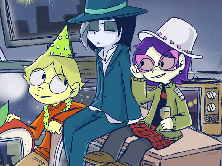
That’s right! Cammiluna and Starren Piece will once again be exhibiting at Otakon 2014’s artist alley!

This time, we have our own tables, so there will be more stuff, more space, and more foolery drawtimes!

Now i gotta design prints and banners and stuff,

Stay tuned!

Monday, December 30, 2013

Tuesday, September 10, 2013

Of Inks


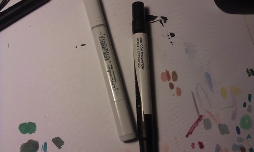
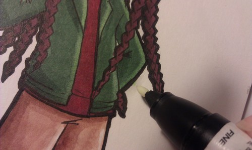
Regularly, I alternate between different inks depending on the coloring medium, paper, or where I’m drawing.

Recently, I got a hold of these:


Faber Castell PITTs. India-based ink, comes in a large assortment of sizes. In the 8 pack, I don’t like the soft brush or soft chistle as I have no control over my strokes with them. The other large size I only use to write signs, but it’s good for filling in black spaces, I guess.

India ink is water proof, but not 100% alcohol proof. On many paper types you need to let the inks dry for a few hours before grinding your markers on it like I do. If you just color flats or do light blending, the ink holds off pretty well! On mixed media paper, the inks still smeared from my markers a day after inking.

Faber Castells are my go-to markers for moleskine paper and watercoloring.


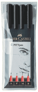
This is the smaller pack of the pens. Has three nib sizes plus the classic brush which is awesome for thickening some of the lineart. The bigger pack has an Extra Small (XS) nib which I find nice for fixing some jagged lines.


More india ink, Speedball wasn’t fucking kidding when they put “Super black” on the label. It’s gorgeously black. I use this at home when I’m drawing larger things (like a character portrait on 9x12 bristolboard) or on textured paper like watercolor pads. I can’t get regular pen strokes to stay consistent when I draw large or on bumpy surfaces, so this does the job and so nicely.

But wow does this ink suck with alcohol markers! I inked a commission with this, colored it almost two weeks later and the lines STILL smeared. I think the same thing happened with mixed media paper. Watercolors won’t budge it, though.

I found Acrylic ink to be better with markers but you have to shake the bottle regularly because whatever dry bits come up will mix in and you’ll be inking with little black specks.


Pigma Dengars. You will find yourself replacing these a lot, but they are cheap and are totally marker proof. They’re even completely marker proof in more paper types than copic pens and stroke over textured surfaces better than other pens. Do not diss the pigmas. The brush pen… I don’t like it too much. I just manually vary line widths by juggling the other pen sizes.

Most of mine are dead right now, so I’m currently using the Faber Castells for my marker work. Carefully.


Copic Multiliners. They come plastic disposable and metal refillable.It lasts a bit longer, the ink is a little blacker than microns, and if I remember correctly, a copic representative said that their 0.05 pen is the smallest nib in the whole technical pen market. It is of course Marker proof.

I bought three of these about three years ago, I think. a 0.05, a 0.3, and a brush. the brush dried out quickly with the brush itself getting too busted to be useful for details anyway, and the 0.05’s nib also broke so I couldn’t use that one anymore. I kept the 0.05 in a drawer, and when my 0.3 ran out of ink, I swapped the cartridges.

Owning the metal copic multiliners is like owning a set of Samsung electronics. As good as they are, If you’re a clumsyfuck, you’re going to break them.

For a while, my technical pen set was basically a Micron 005, Copic 0.3, and microns 05 and 08.


I also have the Rotring art pen you gave me a while back, but its last ink cartridges have dried up. I have the pen itself stashed as a keepsake.

Sunday, September 8, 2013

New Markers


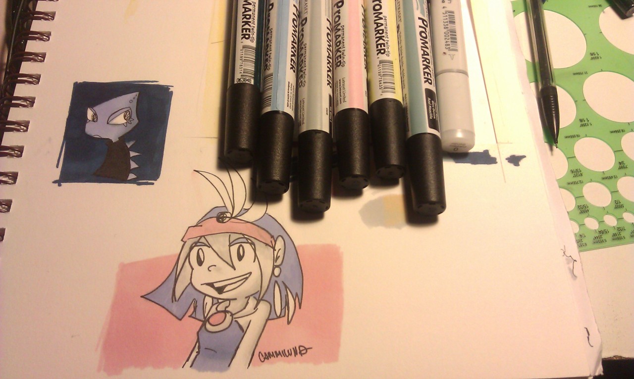
I ordered some Letraset ProMarkers a few weeks ago, but shipment was delayed since a bunch of them were out of stock at the time I ordered. Even after the delay, the order was split into two shipments. Today I received six markers. The other fourteen are coming on Monday (i think i said 26 in a tweet earlier forgetting I bought a 12-set and not a 24 one)

Katzii was telling me about these markers for a while and sent me the original comic drawing of the Banjo-Kazooie/Chocolate Pudding 4am crossover (I can’t take it out now, I have it secured between skechbooks in one of my bins until I get my own bedroom to hang it up). The colors were so nice and smooth, like flat digital coloring. I wanted to try them myself!

If you follow us both on twitter, you’ll see WE’RE ALWAYS TALKING ABOUT MARKERS :D

I was going to go with the flex markers originally, which have brush tips, but the promarkers had more colors and were cheaper atwww.dickblick.com, so i was able to get more colors for the $50 I had budgeted for them.

They feel a little lightweight compared to prismacolors and copics, have the fine tips like prismacolors and chisel tips like copics, and do not emit obnoxious smells when you color with them (unlike Chartpak, though I last used those nine years ago). I don’t think I can properly describe how the ink flows out of the pen. It’s like kind of heavy and consistent to where you can lay down flat color pretty quickly and not see any streaks, and if you miss a spot and fill it, you’ll barely notice. If you shade through layering the same color, it will take a few layers and that’s after you let the first layer dry. If you shade with assorted colors, these markers blend really well on absorbant paper like the other brands, but probably better because the tips are really wet.

The 12-set comes with an added colorless blender, but since that didn’t arrive yet, I blended the greys on Azu-Maya with a copic blender and it worked out really well!

I’m gonna try more paper types over time, so far I’ve only scribbled on Mixed Media paper and computer paper. It took a little getting used to but I am really loving the results! I can’t wait for the others to come in, but it’s also fun seeing what color schemes I can whip up with the six I have now.

More info on the Letrasets including colors and different marker types can be found on their website. Blick has the markers for $2.61 per single.

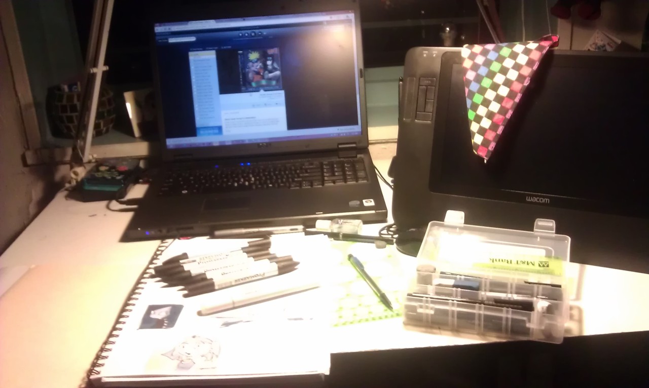
And enjoy the most recent snapshot of my workstation.

Saturday, August 17, 2013

Otakon 2013


Last weekend, I've made my Artist Alley debut as a web cartoonist over at Otakon 2013 in Baltimore, Maryland and with me was Christi Warren of Prismatic Star.  I have to say it was really amazing. We were visited by old friends, made new ones, and gave out lots of business cards promoting our comics.  It was a lot of fun just being there, drawing pictures, eating snacks and shifting through various table layouts.  In a separate post, I'm going to talk about running an artist alley table.  Sure, I may have been a complete newbie without any kind of vertical displays or shiny photoshop-filtered bishonen pin-ups, buttons or plush alpacas for sale, but there was a lot that I've picked up from this learning experience.

I want to thank our assistant FC for his speedy response with our demands ;) as well as our other assistants Joe and Keith, and the Artist Allet staff at Otakon for being all nice and awesome.

And special thanks to everyone who visited the table and checked out my comic whether at the table or online!  I love you all!


Friday, July 5, 2013

of Watercolor

I recently got re-hired at my former place of employment full time as a graphic/web designer and mail clerk. It's been very busy.


One of my co-workers saw my watercolor stuff and asked me to email her the amazon links I got them from.  This is raw copypasta I'm too lazy to fix.  Also, I'm going to fix this blog up a bit sometime soon.

http://www.amazon.com/Art-Alternatives-Pocket-Watercolor-Set/dp/B000JQSV88/ref=sr_1_1?ie=UTF8&qid=1373073226&sr=8-1&keywords=art+alternatives+watercolor

The link above is the watercolor paint case. 18 colors, convenient metal case, comes with a regular brush. Amazon slashed the price on this recently.
http://www.amazon.com/Koh-I-Noor-Watercolor-Wheel-Stack-Pack/dp/B0006OLQLC/ref=sr_1_1?s=arts-crafts&ie=UTF8&qid=1373073443&sr=1-1&keywords=koh-i-noor+watercolor

This is another paint set I have, which is four trays of six colors that stack up into a little roll.. I like it better because the colors are richer and more vibrant (this would be "professional quality" paint while the other set i showed you is "student quality". "Children's quality" would be crayolas you find in Target), but they're just a little less convenient to travel with. I can bring this to the office one day if you want to see them.

http://www.amazon.com/Royal-Brush-Aqua-flo-Set-3/dp/B001H8IIUI/ref=sr_1_4?s=arts-crafts&ie=UTF8&qid=1373073690&sr=1-4&keywords=waterbrush

This is the waterbrush. You fill it with water and this keeps the brush wet for painting. This is a pack with three brushes in different sizes. Good for experimenting.

The next three links are different types of watercolor paper. Any brand is fine. I like smaller ones for portability, but I use large paper for works I sell to people and submit to anime conventions.
http://www.amazon.com/Strathmore-Series-Watercolor-Paper-bound/dp/B00251AIO0/ref=sr_1_1?s=arts-crafts&ie=UTF8&qid=1373073809&sr=1-1&keywords=watercolor+pad

This one is large. Has less sheets but the pages are nice and big.

http://www.amazon.com/Strathmore-Visual-Journal--140lb-Watercolor/dp/B003YIXDKE/ref=sr_1_1?s=arts-crafts&ie=UTF8&qid=1373074045&sr=1-1&keywords=strathmore+visual+journal+watercolor+5

This one is small, but not too small. I can show you mine for a size comparison. These make great hobby sketchbooks. Especially since an artist should always take a sketchbook with him wherever he goes.

http://www.amazon.com/Moleskine-Watercolor-Notebooks-times-Notebook/dp/B002YKMN4U/ref=sr_1_10?s=arts-crafts&ie=UTF8&qid=1373074212&sr=1-10&keywords=moleskine+watercolor

This is what I carry around with me typically (and you saw this in the office. Moleskine books are a lot more expensive than regular watercolor pads the same size, but it has a sturdy cover, a folder pocket in the back cover, and is considered very fancy and professional. The paper is top-notch, too!

Now for the pen

http://www.amazon.com/Sakura-30062-6-Piece-Pigma-Micron/dp/B0008G8G8Y/ref=sr_1_7?s=arts-crafts&ie=UTF8&qid=1373074212&sr=1-7&keywords=moleskine+watercolor
Micron pens are bold and waterproof. Anything drawn with this, when dried, will not get messed up when painting around it., and this is the cheapest deal you'll get with professional grade inks. Compared to more expensive pens, these dry out kind of quickly, but are the easiest to replace because everyone sells them and they're dirt cheap. 

Monday, May 13, 2013

HiEx book is finally underway

I knew from the start of making this comic that I had to draw the pages in high-resolution. What I didn't do off the bat was assemble the final print-ready pages when the web versions were done. This came in part from not knowing what company I was going to choose to print my comics. Each one I've seen requires a different file format, different trim/bleed dimensions, only prints in specific sizes, etc.   Also, the pages were drawn in A5 proportions, but in 7.5x11", which do not translate well when slapped traditional comic book page sizes, and the high-res pages were split with the artwork being in Paint Tool SAI files and the text and word balloons being in Photoshop files.   With all the copying, pasting, cropping, layer merging and consistency edits needed to be done, putting this comic together for print was going to be a mess, and it is something I have worked on in pieces for a few months now.

Then there was the proposed artbook I was going to make as a donation incentive. In the end, I decided to make the art book and the comic a thing put together.

Originally, I had skipped last week's comic update because of a new video game addiction, but that game was completed before the weekend, and the weekend was spent juggling between spending time with my mother, and learning Adobe InDesign, both to land a job in desktop publishing and to put this book together (Scribus was not working out for me). The 88 high-res pages done so far were all assembled in Photoshop and JPG files and the "Master Page" feature in InDesign made things so much easier.

Now with the pages set up and the art book text written, all that's left to do is to finish this chapter, work on the bonus comics, and make some new character drawings.

I'm looking at a completion date sometime in the summer, but with the time constraints I have, my webcomics may be facing a month or two hiatus in the near future to get this book done.

Sunday, May 5, 2013

Free Comic Book day and site changes.


I was gone for most of Free Comic Book day, but we still have three hours in the Pacific Time Zone. In 2004/5, I made a 16-page comic in attempt to become a somebody and published it via Lulu.com. Compared to what I draw today, this looks like shit, but since I announced on twitter yesterday that I’m resuming development of this story, I thought it would be cool (or at least a good laugh) to bring this back from the grave it was buried in for so long and give it away.

The comic will start some time canonly after the events of the pilot, so this won’t be a reboot, exactly.
_____________________________________

Some parts of this blog may appear or function kind of wonky for a while. I'm currently making changes to make this blog my main website, and it can now be accessed through www.cammiluna.tk. The art gallery will be updated and moved as well, but I currently have found no ad-free wordpress-customizable (or gallery script installable) free hosting that can hold more than 250mb of files, so there is nothing I can do yet. I want the gallery to match the design of this blogger. Feel free to drop me a line if you know of a good hosting service.

Tuesday, April 23, 2013

Let's Talk About Immortal Fool


A few days ago, I just finished drawing Chapter 5 of a webcomic called "My Immortal Fool."  Most of the time when I talk about my comics to people who are NOT fans of Nintendo characters, I usually just refer to Highly Experimental, but on the side, I've been working on this one, too.  It's a fan comic of the comedy-drama type that follows the exploits of a few villains from the Super Mario games taking place in the Bean Kingdom from Superstar Saga in particular.

The comic itself began in early 2010 based on an unfinished fanfic idea I had six years prior that fans of mine had wanted to see revived.  I chose to make it a comic because I was afraid of making comics.  No comic I've attempted in the past had lasted long and I felt like my art would never be good enough to make Highly Experimental a successful reality.  For the most part, Immortal Fool had a story that was almost fully planned-out, so all I had to do was draw pages and see what my capabilities were. The comic was posted on deviantArt and had a tiny handful of responsive fans that made this project fun and kept me going.  Not to mention, I was able to try different line and coloring styles, try different perspectives and layouts- basically do anything that I couldn't get away with in a serious ongoing webcomic. I mean, it's just a lame fancomic. If a critic were to tell me to be more serious with this comic, they would more likely say "draw an original comic instead" rather than "improve this fancomic."  Anyway. Later that year, I finally had the guts to work on Highly Experimental and started planning out the story and concepts for several months, and in Spring of 2011, I finally launched the comic on the web.

From then on, Immortal Fool was no longer my main comic, but while it was updated less and less, I couldn't let it die.  I get the feeling that fan comics are pretty frowned-upon in webcomics communities, and honestly, I would have had time to shell out two HiEx pages a week if I would have just axed Immortal Fool altogether, but it just didn't happen.

There are two big reasons for this.  Firstly, the fanbase. I've mirrored the project at ComicFury (IF currently runs alongside Mushroom Go on that site) and the reader base continued to grow both there and at deviantArt. It's not a big fan base, I don't get a lot of fanart of this project, and the last Formspring question I've received for it was in mid-2010, but I still get feedback when I post pages.  When I return after a long hiatus, I get really touching comments from some people on how glad they are that the comic is still running, and a couple of fans have even mentioned the comic when I've introduced myself.   I find it to be a rather arrogant idea to put down a successful fan project because I'm suddenly an original character artist or something  now. I love my fanbase.  The comic will eventually come to an end, but not without an actual ending.

And secondly, I vowed to finish this comic. I think I just said that.  There's only three more chapters left.

When it's time to make HiEx into a book, there will be a long hiatus for Immortal Fool, but rest assure, it will continue.


Happy third anniversary, awful cesspool of headcanon in comic form!

Sunday, January 20, 2013

Let's call this the "Adobe Mock Suite"


Adobe: Build Your Own Adobe Creative Suite with Free and Cheap Software(via @Lifehacker)
Adobe’s Creative Suite is one of the best software packs out there for professionals, but the suite is prohibitively expensive for most people. If you can’t drop the cash, you can still get a similar experience with free or cheap software.
As someone trying to get work in the graphic design field, I’m thinking of downloading some of these free programs to learn the basics (namely Scribus and Inkscape) and if I do that, I will let you guys know whether or not these freebie compensations Employers will bother to look at your resume or not if their job opening requires “proficient adobe CS knowledge.”
There are some Graphic Design jobs out there that just require knowledge of Photoshop. Like, if you can slap stock pictures and text on a banner or page and know the size you need to make it for print, you’re qualified.  My first job worked like that and a couple of IT companies had pulled out my resume and called me for a graphic design position instead of the IT spots I had originally applied for with them.  I didn’t get either of those jobs probably because I came off as a timid little shit in the interviews, but I think this might useful to know for all you photoshoppy artists looking for work.

Saturday, January 5, 2013

Using Colorless Blender Markers


Yeah, these:
image
Some people know about them, some people don’t care, some people leave these to collect dust asking “how the fuck do you use these?!”
right?
This post is for the people who ask “how the fuck do you use these?!”
Sure, there may be lots of online resources for markers, but I feel like doing a straight-to-point one for my [tumblr] followers.
COLORLESS BLENDERS DO NOT BLEND TWO COLORS TOGETHER.
Try all you might. You might get some that looks like two colors blended together, or maybe you just got a pale mess on your paper.
Colorless blenders DILUTE COLOR and PUSH IT AWAY
It’s basically… kind of… turning your marker into watercolor except the water is alcohol so it’s kind of becoming wateralcoholcolor or something.  Some people have used a trick where you dab the end of your colorless blender onto the ends of two colors and that causes the colors to mix when you lay it on the paper with the blender.  I haven’t tried this yet.
You can stop reading this entry now and toss those blenders out of they’re no use to you after all.
But what if you WANT to know what you can do with the blender???
0. Copic and Prismacolor have the same blender but different nibs to work with
I like to have one of each. The Prismacolor blender has sturdier nibs for details and texturing (discussed later) while the soft copic sketch brush nib is more comfortable for blending and gradients. If you’re a user of different/better/cheaper markers and they don’t come in brush nibs, I highly advise to add this one copic to your stash. 
image
1. Make pretty gradients.
 Mind you, this sample doesn’t look very pretty. Anyway, rub in some colorless blender over the edge of a light color and you can soften the edge into the natural white of the paper.  Repeat in layers if you want to add more gradient.
image
1a. Blend highlights
If the highlights are the natural color of the paper, again, rub the blender with the nearest color and this will soften highlights. If your highlights are an actual marker color, like yellow, use that color to blend instead of the blender.
If requested, I will go into this in more detail with a marker shading tutorial. In the future.  Maybe. 
image
2. Lighten up mistakes
It’s pretty inevitable that when you color an inked drawing, some color may spill outside the lines.  Rub some blender over it!

Dark colors will dilute into something lighter, and lighter colors will almost vanish. Make sure to direct your strokes towards the drawing. If you stroke your marker outward, you’re going to spread some faint color on the canvas.
Both Prismas and Copics can do this job, but the flat end of the copic does get destroyed a lot easier if you find yourself rubbing pretty hard, so go with Prismacolor or something sturdier, even if you’re an avid copic user. 
image
3. Make highlights
Take whatever marker tip you’d like and draw slowly over the color. It’ll look like shit when you first make the strokes, but it’ll look nicer when it dries.  You can run a little of a lighter color over the newly-faded area for some fancy effect or something.  
image
4. Make Textures
Because fuck photoshop (not really).  While the markers are still wet on the paper, take your blender and simply draw on the colors. tap in some dots, wiggle in some squiggles. Have fun experimenting. There was a lady at an Anime Expo copics class was able to make leafy textures on anime trees but I forgot how she did that.  This is where having blenders from assorted marker brands has the biggest use: you can vary your textures with what each brand of blender has to offer.
I never did this much since I do mostly character sketches where I can’t find a use for textures, but hope to start making a habit of texturing in future drawings
End of Tutorial
Full versions of samples can be spotted here (AmaarĂ©), here (Burds), and here(Polish the Poltergust).
For my markered stuff, I have about 100 Prismacolors that are about 8 years old, and 27 copics that are about four years old and I use them both together.  Most of my art is digital these days so these things have been lasting me a while.

Rebloggable Tumblr version of this article can be found here.

Friday, December 21, 2012

New Portfolio Update


I decided to make a generic illustration one and for the most part, this is set up  You'll find this one at http://camelendez.blogspot.com.

I still have to watermark a few other PDC promos before uploading them, and then I want to add three more sections: graphic design/advertising, character designs, and sketches.  Those will come at a later date.

Monday, October 22, 2012

Highly Experimental's School Uniforms, Part 1

Reference sketches of two team uniforms in highlyexperimental.net
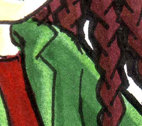
Both will be used in this current chapter, as well as the mechanics team jackets that come later.

Geno’s school, The New Generations Science Academy (or just call it Newgens) has most of their students split into teams of relevant study, with a teacher in charge of each team. Each of those teams have their own specific uniform which is to be worn at team gatherings (which happen twice a week) or certain events where they need to be.  Outside of meeting days, students wear the standard uniform of white polo/button shirts with teal pants/skirts/sweaters/ties/etc.

Some students wear their team uniforms on non-meeting days to express pride of the team they’re in, but it’s generally considered extremely arrogant.  Terrie does not know this yet.  The teams can't compete each other formally for lack of common ground to compete in, but bragging points play a big role. The more your team accomplishes, the more you flaunt.

At present, Team Potpourri is an all-girls class and always has been an all-girls class, so Audrie blatantly kept the colors all purpley. the skirt is just past knee-length, but for someone as short as Terrie, it stops at her ankles.

Males can enter this class, but there aren't any interested yet at present. It actually isn't because of anything gender-related, but because the girls already in that class are pretty nasty and elitist.

Green popped up on Google several times as a relaxing color, so I thought it was a good choice for the psych team’s uniform on the right. Dark green dress shirts are default, but any non-revealing dark green top will suffice. Mary wears a skirt with the outfit, Kat wears whatever she feels up to (but she likes skirts very much).

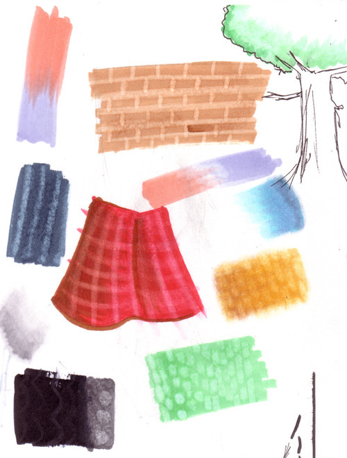
The silvery blue colors are just reminders for me on the Mechanic Team’s uniform and the yellow is possibly for the Astronomy/space team.
There’s more teams than this, but none that the main characters are in so I haven't thought them up yet.
I’ll go into more details about the teams another time.

Wednesday, August 1, 2012

To script or not to script

"Also, since I’ve been wondering, do you use a storyboard/script to plan the plot, or do you make things up as you go?"
This was asked on the site around two months ago.
I have a written document of the main points that happen both in each chapter, as well as bigger events for the story as a whole. Sometimes I will make note of particular lines I want someone to say, but otherwise, this is just a list of actions with no words. … Except maybe, “they talk about science” or “riveting discussion about the clock”.

Then I draw the thumbnails of about 5 pages at a time to plan out how I want each shot to work, and then the dialogue is made up as I go.

Scripts don’t work for me because I hate reading scripts (nothing against them, just personal taste). I can’t imagine what’s going on as these guys are yapping because I’m just staring at the format and it’s hard to deduce what it’s going to look like as comic panels. If I draw the actions first, I can arrange the shots however I want, and this inspires better dialogue.

But as I said, it’s the main points that are planned out. I have a general idea for small happenings between them, but those holes are generally filled as I go along (usually by the time I get to those points, I have much better ideas for them). And sometimes things don’t work out as I’m drawing them, and I make changes as that happens.

Saturday, July 21, 2012

Work portfolio blog coming soon.

In a hopeful attempt to increase my chance of job hunt feedback, I've decided to set up a Linkedin account and compile a portfolio blog of my works from Preferred Dental Care. I've gotten clearance from the previous manager last year just so long as I watermark the material.

And...

Well...

I have a lot of stuff to watermark. :)

The new blog will be found here though I may change the URL name when I think of something better.  ("Smilebaby" was taken.), as for why "Smile, Baby", let's just say that working in dentistry reminds me of one of the pause screen quotes from a Gameboy Advance game called It's Mr. Pants, though that saying is probably commonplace in  this world...

Friday, June 22, 2012


This week, I started Chapter 3 of Highly Experimental. I kind of don't like the fact that it took thirteen months to get this far, but I should be happy that I've made it this far at all. I've attempted comics, both fan and original since 2001, and I've always stopped after a few pages.  At Page 63 now, this is the longest running original project I've done, and while there's going to be, possibly a two-week break due to vacation and getting other needed things done, I do look forward to working on this.

There's also the print project: Getting HiEx published in book form.  Originally, this was going to be a novel, but then I decided to make it a comic even though I barely know how to draw anything in the story, and pretty soon, it will be a graphic novel.  I just need to find a good place to print. Lulu is too expensive and the format of these pages don't fall within Ka-Blam's standard or manga templates. The first volume will cover the prologue and chapters 1 and 2, which totals to 62 pages. I should put in some extras, yes? I have to decide on what extras they will be.

Sunday, June 17, 2012

Hello again.


It's been about four years since I've updated this blog, maybe more. It's been an amazing adventure full of trolls, artists and dentists, slapping pictures on tumblr, and I've launched a webcomic, but right now amidst my adventures of job-hunting with the experience I've juggled at my last position, I found this really nice calling for social media management, but realized I haven't had a blog with with significant text content more than 160 characters long in quite sometime, and with my tumblr being too much of a flashy obnoxious image dump to be taken seriously, it's time to re-open this one.

It's also a pretty cheap move to do this when applying for work instead of having a blog already active when doing so. If I don't get the job, at least I can work on my blogging some more, right?

And let's keep it about stuff I like: Art, video games, and webcomicking. Maybe also what's gone on in my life these past two years. Right now I have a comic page to finish.

And remember the baby I posted pictures of in the old days? He's now four years old and playing Mario Galaxy on his own! :')

Sunday, May 3, 2009

I was hoping i wouldn't go this long without updates again.

So here's Mr. Fit from Banjo-Kazooie and Dr. Saturn from Earthbound!


Friday, December 26, 2008

Wednesday, December 24, 2008

More gamer stuff in an art blog

I should start a gamer blog, but who the darn would read something they've already read in every other gamer blog on the internet.

But anyway, some quick notices on gaming news that I actually care about:

1.

While a preview isn't availible anywhere on the internet right now, I recently came across some CHOWDER gamer pictures over at the Xbox Live Marketplace. I love Chowder and this made me very happy inside. For 100 MSPoints, you get six gamer pictures featuring those of Chowder, Mung Daal, Shnitzel, Truffles, Panini, and ENNNNDIIIIIVEEE.... >B[ Just check under the Cartoon Network section of the Gamerpics marketplace. Flapjack Gamer pictures can be found there, too.


2.

Banjo-Kazooie's enlarged text is now availible as a downloadable patch for the game. See the BK Blog for details.

I still haven't drawn in a while and .... if I do shell out a christmas pic, it'll be late, so for now...


Have some mail-ordered Chowder i drew for Tora's package last year!

Tuesday, December 16, 2008


Nothing for show today, but I promised my aunt Medi I'd show off more pictures of little Mikey. Where are my others?