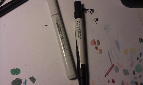
Yeah, these:
Some people know about them, some people don’t care, some people leave these to collect dust asking “how the fuck do you use these?!”
right?
This post is for the people who ask “how the fuck do you use these?!”
Sure, there may be lots of online resources for markers, but I feel like doing a straight-to-point one for my [tumblr] followers.
COLORLESS BLENDERS DO NOT BLEND TWO COLORS TOGETHER.
Try all you might. You might get some that looks like two colors blended together, or maybe you just got a pale mess on your paper.
Colorless blenders DILUTE COLOR and PUSH IT AWAY
It’s basically… kind of… turning your marker into watercolor except the water is alcohol so it’s kind of becoming wateralcoholcolor or something. Some people have used a trick where you dab the end of your colorless blender onto the ends of two colors and that causes the colors to mix when you lay it on the paper with the blender. I haven’t tried this yet.
You can stop reading this entry now and toss those blenders out of they’re no use to you after all.
But what if you WANT to know what you can do with the blender???
0. Copic and Prismacolor have the same blender but different nibs to work with
I like to have one of each. The Prismacolor blender has sturdier nibs for details and texturing (discussed later) while the soft copic sketch brush nib is more comfortable for blending and gradients. If you’re a user of different/better/cheaper markers and they don’t come in brush nibs, I highly advise to add this one copic to your stash.
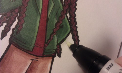
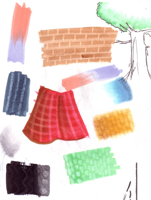
1. Make pretty gradients.
Mind you, this sample doesn’t look very pretty. Anyway, rub in some colorless blender over the edge of a light color and you can soften the edge into the natural white of the paper. Repeat in layers if you want to add more gradient.
1a. Blend highlights
If the highlights are the natural color of the paper, again, rub the blender with the nearest color and this will soften highlights. If your highlights are an actual marker color, like yellow, use that color to blend instead of the blender.
If requested, I will go into this in more detail with a marker shading tutorial. In the future. Maybe.
2. Lighten up mistakes
It’s pretty inevitable that when you color an inked drawing, some color may spill outside the lines. Rub some blender over it!
Dark colors will dilute into something lighter, and lighter colors will almost vanish. Make sure to direct your strokes towards the drawing. If you stroke your marker outward, you’re going to spread some faint color on the canvas.
Both Prismas and Copics can do this job, but the flat end of the copic does get destroyed a lot easier if you find yourself rubbing pretty hard, so go with Prismacolor or something sturdier, even if you’re an avid copic user.
3. Make highlights
Take whatever marker tip you’d like and draw slowly over the color. It’ll look like shit when you first make the strokes, but it’ll look nicer when it dries. You can run a little of a lighter color over the newly-faded area for some fancy effect or something.
4. Make Textures
Because fuck photoshop (not really). While the markers are still wet on the paper, take your blender and simply draw on the colors. tap in some dots, wiggle in some squiggles. Have fun experimenting. There was a lady at an Anime Expo copics class was able to make leafy textures on anime trees but I forgot how she did that. This is where having blenders from assorted marker brands has the biggest use: you can vary your textures with what each brand of blender has to offer.
I never did this much since I do mostly character sketches where I can’t find a use for textures, but hope to start making a habit of texturing in future drawings
End of Tutorial
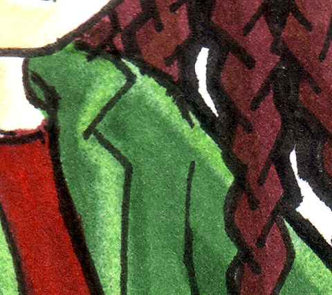
Full versions of samples can be spotted
here (Amaaré),
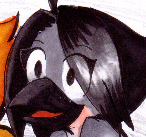
here (Burds), and
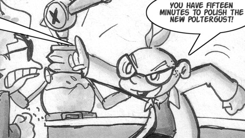
here(Polish the Poltergust).
For my markered stuff, I have about 100 Prismacolors that are about 8 years old, and 27 copics that are about four years old and I use them both together. Most of my art is digital these days so these things have been lasting me a while.